
How to make highway-worthy billboard creative
A 4-step framework for B2B billboard creative, plus reviews of real billboards & a Claude skill to grade OOH creative | Part 2/2 in Billboard Drive-By Series

👋 This is a monthly free edition of MKT1 Newsletter—a deep dive into a B2B startup marketing topic, brought to you by Framer, Profound’s AEO build session, and 42 Agency.
📅 Save the date: MKT1 MCP Showcase featuring 6 GTM presenters on 7/28, RSVP here (free to all) ➜
Upgrade to a paid subscription for: Full access to our new MKT1 MCP Server | 100+ templates & resources | Post to MKT1 Job Board | MKT1 Newsletter Archive | $40K+ in discounts in the MKT1 Perk Stack
A billboard might look like the easiest creative format in marketing: a few words, one image, done. But that’s exactly what makes it deceptively hard. Your one idea needs to land with your audience in a few seconds, or you’ve spent a lot of money on nothing.
I want to help you get this right, for your sake, for your company’s sake, and for the people moving through the streets of San Francisco and beyond looking at these billboards!
So, to prep for this 2-part newsletter series, I drove around SF with Maya Spivak, one of my go-to brand and billboard experts (among other things), analyzing all things out-of-home. And we of course recorded it and made a video series too called Billboard Drive-By.
In part 1 of the series, I covered how to decide if you should buy a billboard at all. You need both billboard <> startup fit and a real goal for buying OOH right now. So let’s assume you’ve got both: The channel makes sense for your company, and you’ve got a solid reason (not just “a competitor bought some billboards”). Now you have to decide what actually goes on the billboard.
Much like a homepage hero, you have limited space to lay out your positioning: at least who it’s for and what it is, and if it fits, why it’s better. Unless you’re Anthropic, Nvidia, or Apple, which you’re not.
But unlike a homepage hero, a billboard gets read at 65 mph, by people who weren’t looking to be sold anything, just trying to get from point A to point B.
This newsletter walks you through my 4-step framework for making standout billboard creative, complete with tests and checks. Plus, I’ve reviewed 5 of the billboards Maya and I saw in the wild with help from our new /billboard-creative skill trained on all the context in this newsletter. The skill is in the MKT1 MCP for paid subscribers, so before your creative hits the highway, you can run it through all the checks.
Recommended products & agencies
We only include sponsors we’d recommend personally to our community. If you are interested in sponsoring our newsletter, email us at sponsorships@mkt1.co.
Framer, the site builder, just launched Agents, right inside the Canvas. You keep the structure and editing control you need for a full company website, and get the speed and capabilities of an Agent working alongside you.
🔓 Offer: Get 30% off annual pro with the code: MKT1.
—
42 Agency is a MOPs & paid media agency that kicks off differently. They start with a Revenue Opportunity Analysis that digs into your ad accounts, CRM, and closed-lost deals to find where revenue is leaking. Then they fix it.
🔓 Offer: First 5 companies to redeem get 15% off a revenue opportunity analysis.
—
Join me and Profound for an AEO build session on July 23: Nick Lafferty of Profound, the AI workbench built for marketers, and I will build the 3 AEO workflows all marketers need in Claude with Profound’s MCP.
🔓 RSVP: Register for the free event here.
In this newsletter:
This 2-part newsletter—with videos from a Billboard Drive-By with Maya Spivak and a Claude skill for reviewing billboard creative—helps you make informed OOH (out-of-home) decisions.
📍 Part 2 (this newsletter): What should you put on a billboard?
4 steps to make standout billboard creative: 1) Catch your ICP, 2) Nail the message, 3) Make it legible, 4) Bring the magic
Billboard reviews: Baseten, Rippling, Braintrust, Framer
More MKT1 OOH content and resources:
⏪ Part 1 of this series: Should you do an OOH buy?
This newsletter helps you figure out if you have billboard <> startup fit and a solid goal. Start here when you get your next request to buy billboards!
🤖 Billboard-Creative skill: We built a skill for checking billboard creative, available in the MKT1 MCP for paid subscribers.
📺 Billboard Drive-By: 11 mini-episode video series with Maya Spivak
About Maya: Maya Spivak loves building and supporting beloved tech brands. After 15 years of full-time, in-house brand marketing leadership, Maya started an independent microagency called Marketing.fan where she and a small team of creatives build and execute brand marketing campaigns and promotional media strategy. Although Maya enjoys all types of brand marketing, positioning, storytelling, and experiential projects…about 80% of her business is out-of-home media buying and management. It’s what the people want!
And now, on to the newsletter…
4 steps to make standout billboard creative
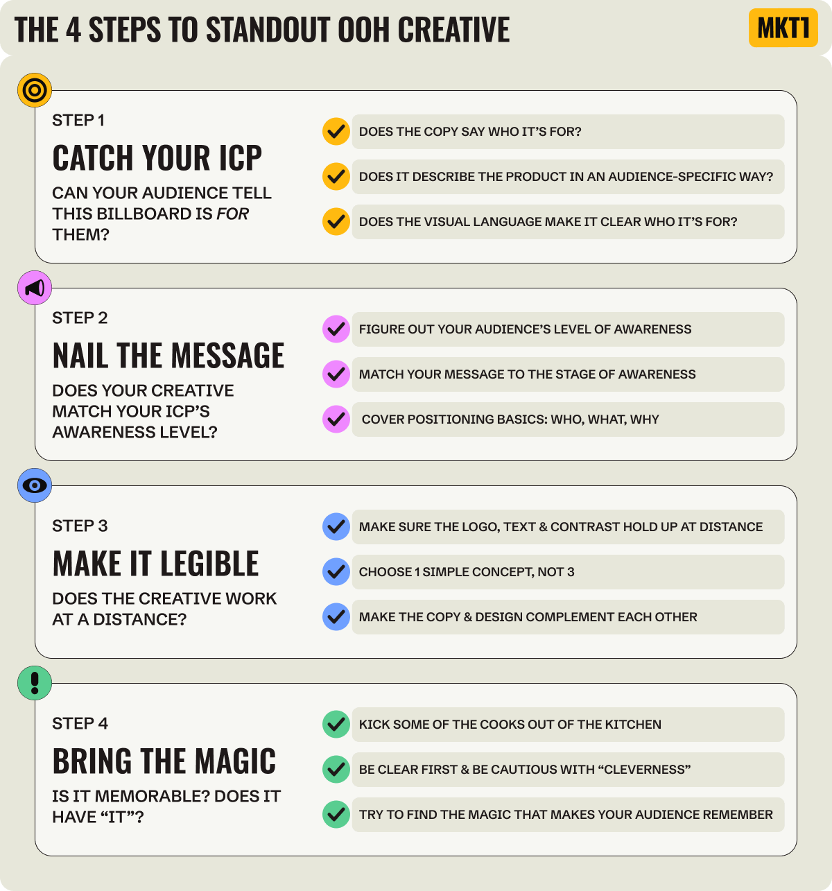
Step 1: Catch your ICP
First things first, the person you are trying to reach needs to realize your creative is attempting to speak to them, immediately, before they zoom by.
There are 3 ways to do this, make sure you check the box on at least 1:
Write copy that directly says who it’s for:
Name the audience specifically, like “marketers”, “AI engineers”, etc.Write copy that describes your product in an audience-specific way:
If you don’t expressly name your audience, explain your product in a way that your audience knows it for them.
e.g. Baseten’s billboard doesn’t say “AI engineers,” but it does say the word “inference” which speaks to them specifically.
Show with visual language who it’s for:
A stylized product shot, a photo, an illustration, etc. that signals the category or crowd before they read a word. This is harder to pull off, but powerful when it lands.
Note: Social proof is also a great visual signal of who it’s for. If peers use it, it tells you the ICP and builds credibility.
Step 2: Nail the message
You’ve caught your ICP’s eye. Now you’ve got a second to make your impression count by saying something that matters to them. Ideally your billboard covers the same things a homepage hero does: who it’s for, what your product is, and why it’s better (than the alternative). But that’s hard to do in a contained space. So which parts you actually include depend on the level of awareness, aka how much your ICP already knows about you.
There are 2 parts to this process:
2A. Figure out your audience’s awareness stage
Factor in not only the demographics and firmographics of who you want to reach (including the city your OOH buy is in), but also your ICP’s “awareness level.”
And if you aren’t sure, assume the OOH audience is less aware than you think—because many people won’t be in your ICP at all.
Unaware: They don’t even know they have the problem your product solves yet.
Problem aware: They recognize the pain point, but don’t know a viable solution exists. They don’t know you or your competitors’ products exist.
Solution aware: They know solutions in your category exist, but don’t know your product specifically.
Product aware: They know you offer a solution to the problem.
Brand & product aware: They know you as an option in the category, recognize your logo, and if someone said your name they’d know what your product does.
2B. Match the message to that stage
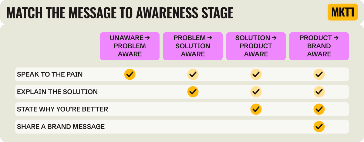
The more awareness you have, the more options you have for what you can say. If your audience is…
Unaware → problem aware: Speak to the pain.
e.g. Vanta's "Compliance that doesn't SOC too much" names the pain, compliance is a slog, with a wink.Problem → solution aware: Explain the solution.
e.g. CodeRabbit's "AI code reviews" just says what it is.Solution → product aware: State why you’re better than other solutions.
e.g. Rippling’s “HR, IT, and Finance in one” copy implies it’s better than stitching together tools.
Product → brand aware: Share a bold brand message, you’ve earned it.
e.g. ChatGPT runs photos with just their logo and no explanation and Figma's boards say "Made in Figma" with not much else.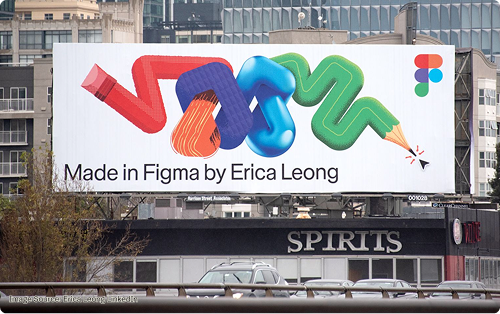

Creative fails when you assume your audience has more awareness than they do. You can’t say you’re the best solution in a category when no one has any idea what the category means or why it exists. You can’t just throw your logo up with no context if no one has ever seen it before.
To reinforce this point: You aren’t ChatGPT…
So a random photo on a billboard with just your logo will likely be a waste
Actual photo of me if you try to emulate an OpenAI billboard for your growth-stage B2B startup:

And here’s what Maya and I had to say about those ChatGPT photo billboards. We think one line of copy, like “In the moment…” would have gone a long way.
Watch this episode & the rest of the Billboard Drive-By series on YouTube. ➜
2C. Final check: Does your copy cover positioning basics?
Positioning should answer who your product is for, what it is, and why it’s better (than the alternative). You usually can’t fit all of this on a billboard, and you shouldn’t force it. The priority is matching the message to the audience’s awareness level. But if you can cover all three positioning basics without cluttering the board, that’s major bonus points!
Who it’s for: Does it name the audience directly or imply it through copy and visuals?
What it is: Does it name the category or describe the product?
Why it’s better: Does it explain why it’s a better choice than the alternative?
Note: So much copy sounds exactly the same right now, “agents” and “AI for [x]” all blend together. If your “what it is” could just as easily be 500 other products, it’s not specific enough!
Fun game: Count the % of billboards that say AI or agent as a passenger (not a driver) next time you take an SF drive. Watch here ➜
Just for fun: One billboard stood above the rest when it came to nailing positioning…
“It’s telling me what it is: ad space. It’s available: why it’s different. Who it’s for: Anyone buying ad space. And it has a phone number, call to action!” –Emily Kramer
Watch this episode & the rest of the Billboard Drive-By series on YouTube. ➜
For more on positioning in general, read the MKT1 positioning guide newsletter.
You can also run my /homepage-positioning-audit skill in the MKT1 MCP ➜
Step 3: Make it legible
A billboard gets read while in motion. Sounds obvious, but OOH creative often doesn’t seem to be designed with this in mind. A driver has 3–6 seconds, an on-foot commuter a little more, and someone on one of those rental electric scooters—well please just focus on not hitting a pedestrian, not on the OOH. Point is, if someone can’t take the creative in at the speed they’re moving, the buy was pointless.
3A: Logo test. Can you read the logo?
Sounds so obvious, but I so often can’t decipher the darn logo!
👍 Rule of thumb: The logo should be roughly 10-15% of the total billboard area.
While logo size matters, the exact percentage matters less than placing it where the eye actually lands. And if you buy lots of placements, you almost definitely shouldn’t put the logo in the same spot each time because the angle, the traffic pattern, and what’s blocking the view all differ.
3B: Text test. Is the font big enough?
👍 Rule of thumb: 1” letter height for every 10 feet of viewing distance. That’s 3 feet of letter height when read at 300 ft!
If the text doesn’t look too big on your laptop, you’re doing it wrong. Go bigger than you think. Bonus: Going big on text also forces you to be succinct, which leads us to the next test.
3C: Concept test. Is it saying just enough, or too much?
👍 Rule of thumb: 1 idea, 6–8 words, max.
Think about both the number of words in your key message and how many “concepts” or ideas you’re covering with the words and the visuals. 1 is best, 3 is way too many.
When choosing the “concept” or “idea,” remember to think through step 2: Figure out the level of awareness of your target audience, and choose the idea that matches best with that stage.
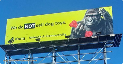
e.g. Kong goes all in on the "not a dog toy" concept. The headline ("We do NOT sell dog toys"), the visual (a gorilla puzzling over the red dog toys in its hand), and the tagline ("Unleash AI Connectivity") all push the same single idea: this Kong is the AI connectivity company, not the dog-toy brand you're picturing. Three elements, one takeaway. That's one concept, delivered three ways, not three concepts fighting for attention. Watch us review it here or read a LinkedIn post from their team about it here ➜
Note: If you have a small tagline with your logo, I don’t count that as a second concept, but it does add to the clutter.
3D: Design elements test. Are the visual elements complementary?
👍 Rule of thumb: If you are unsure whether the visual needs to be there, it doesn’t. Cut it!
The visuals (color, imagery, photo, illustration, layout, etc.) should reinforce the copy and concept, not fight it or just sit there as decoration. Whether you go bold or minimal, every visual choice should earn its place by supporting the concept.
Be “purposeful” with your design elements
Way back when I led marketing at Asana we had a brand value of being “purposeful.” We evaluated everything against this in design reviews (as well as 3 other values), and if anything at all was superfluous it got cut. Those thumbs-up emojis I put in this section probably would have even been cut. You might not need to be this stringent, but it is a good lens!
Here’s an example of a design element that says nothing from Fin’s billboard…what is that orange blob?
Also Fin/Intercom has since been acquired by Salesforce, so expect this orange blob to turn Salesforce blue soon!
Watch this episode & the full Billboard Drive-By Series ➜
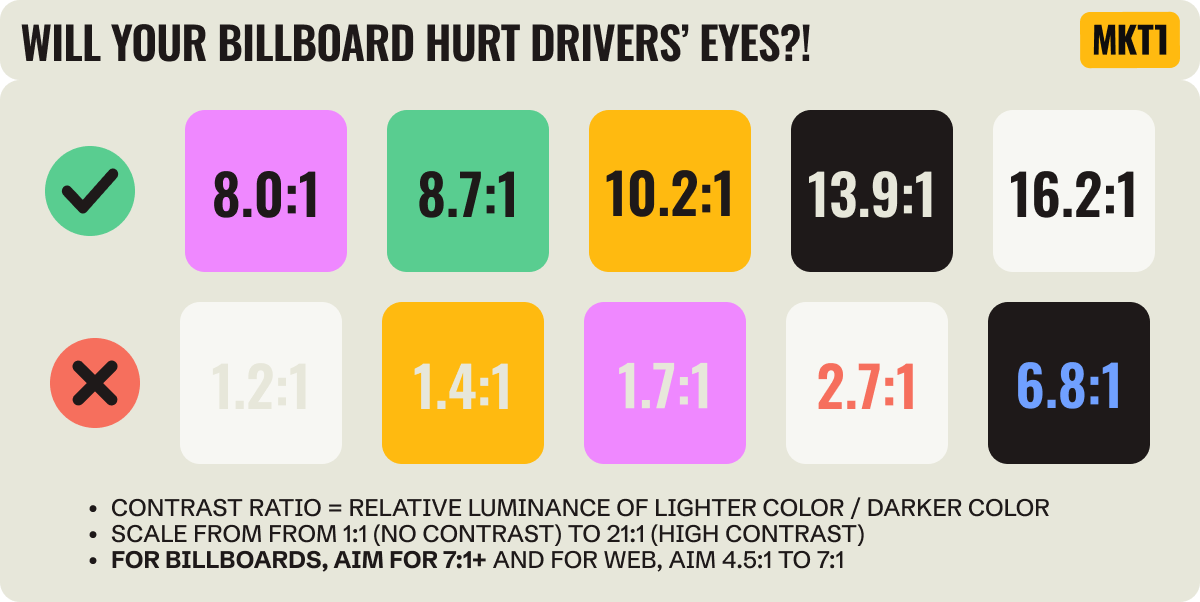
3E: Color contrast test: Does it become a blur at a distance?
👍 Rule of thumb: Aim for a contrast ratio of at least 7:1 between your text color and background color, ideally 10:1 or higher.
Contrast ratio = relative luminance of the lighter color / darker color, on a scale from 1:1 (no contrast) to 21:1 (high contrast).
For reference, the web standard set by WCAG (Web Content Accessibility Guidelines) is 4.5:1 to 7:1. The billboard needs to be higher contrast.
Two colors that look fine together on your laptop but sit at the same brightness can blur together at a distance. Squint till the color drops out and see if the text still pops, or pull the hex values and compute the contrast ratio (or run our /billboard-creative skill in the MKT1 MCP to have Claude calculate it for you!)
3F: Shrink test: Do all the elements work together when you’re really far away?
👍 Rule of thumb: Shrink the creative to business-card size, print it out, hold it at arm’s length, and see if it still works.
This is the catch-all test. All of the elements above need to come together to land in one composition. And just because you “pass” the other 5 tests doesn’t mean you’ll pass this one.
This is also another good chance to check for clutter: Does everything need to be there, from the visual elements to the copy to that tagline?
Step 4: Bring the magic
This is the last element, and the hardest to pin down: the magic. The thing that makes an OOH—actually all creative—memorable instead of just run of the mill.
Even if you follow every rule so far, your billboard still might not land. And even if you break several of the rules, you could still hit upon so much magic that the rules don’t matter at all. That’s the thing about creative, sometimes breaking the rules wins.
Here are some things to think about when trying to find the magic, and avoid the dreaded “what were they thinking?” outcome:
4A: Cooks in the kitchen test: Did too many people weigh in and water it down?
👍 Rule of thumb: Avoid creative everyone is neutral on. That means it has no magic.
The most effective creative, no matter the medium, usually has a point of view. The more people who have to sign off, the safer and blander it gets. The thing that made it work gets erased. A few signs to look for to make sure you are keeping the “magic”:
You want a champion, but also some detractors: Someone who loves it enough to go to bat for it, and a few people who don’t love it…
Pressure-test the dislike: Do the detractors hate it because it’s just not their aesthetic (fine), or for a very good reason (it’s controversial, doesn’t land)?
If everyone is just “fine” with it, it’s been watered down. This isn’t a great outcome.
If you ended up at “watered down,” it can help to go back and review the first concepts you had, were those stronger than what you ended up with?
4B: Try-hard test. Are you being clever, or just trying too hard?
“You gotta look up your meme-speak…I like being hip and with it, but you gotta look up the source of the memes [when designing creative].” –Maya Spivak
👍 Rule of thumb: If you’re asking yourself this question at all, you’re probably trying too hard.
Clever, bold, and opinionated works when it lands, but you want to be sure it will. If people don't get it, or it leaves them feeling bad (cringe, exclusion, confusion), it backfires. Be clear over clever, always, in all B2B creative.
Puns / wordplay: Frequently done, but it’s not for every audience, and it needs to land fast.
Pop-culture references: Only work if most of your ICP knows the reference, don’t get too obscure (I love a cult classic film and some 2000s indie rock, but these references probably won’t land—I might still try in a newsletter, but certainly not on a billboard).
Cryptic inside jokes: Work if you’re comfortable zeroing in on just the people who’ll get it, and confusing the crap out of everyone else.
Shock / provocation: Turns heads, but everyone’s line is different, be careful.
As a general rule, let’s stop being offensive, just collectively? Deal?High art / abstract: Beautiful and simple works for some brands, but can feel forced if you don’t spend time really developing the aesthetic (it’s harder than it looks!)
Some examples of “cringe” in my personal opinion
Apologies to the marketers and creatives that worked hard on these, I know it’s a tough job. And this is just one person’s subjective opinion…
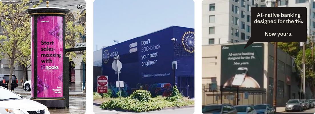
Nooks, “Sales-maxxing”: The “-maxxing” phrase is everywhere right now and it does not have a positive connotation for me. If you’re going to use meme-speak, make sure you actually know how it lands.
Artisan, “Stop Hiring Humans”: It turned heads, and got talked about, and is memorable, but going anti-worker crossed the line for a lot of people and I wouldn’t want so much negativity around my product.
Flex, “AI-native banking designed for the 1%. Now yours.”: The “Now yours” is meant to flip the 1% from exclusion to invitation, but at 65 mph that second line can get missed, leaving just “the 1%” which alienates. If you want to signal premium there are better ways to do this.
Vanta, “Don’t SOC-block your engineer”: A crude-to-many refresh of their great “Compliance that doesn’t SOC too much” billboard. They had the magic and swapped it for a try-too-hard pun. Don’t break what works.
See these examples and more in our “Stop doing this” Billboard Drive-By episode ➜
If you aren’t sure whether the variety of clever you’re putting out there is of the magical variety or the confusing variety, test it: Send it to a few people you trust in your ICP or run a display ad or social test first. One caution: Getting too much feedback can lead to lowest-common-denominator creative too, this is just to gut-check the clever part.
“What I’d do is take a screenshot of your creative send it to some people that you trust, but you prompt with “Thoughts?” Not “Oh, I’m planning to make this live.” If you give people too much, you know that will sway their input. As unaided as you can get it, that’s how you ask.” –Maya Spivak Watch here ➜
4C: Memorable test. Will your audience remember this?
👍 Rule of thumb: If it doesn’t make your ICP think or feel something (preferably positive), they won’t remember it when they are considering solutions.
Did the creative all come together in a way that feels magical, or at least memorable? I don’t have a solid rubric for this one. It’s a feeling. It’s for you, your team, and the viewer to determine. During our drive-by, PostHog stood heads above the rest on this.
Multiple placements need to stand alone, and fit together
The most captivating and worthwhile OOH buys include more than one placement. But, you can’t assume everyone will see all of them, so each one has to work on its own. That said, if someone does see them all, make sure they work together too.
In our drive-by, CodeRabbit took over a whole train station, with tons of creative across a bunch of different concepts. Some were solid (pacman-style bug bashing), some missed the mark. It makes you wonder if there were too many cooks in the kitchen and they just said, “Let’s go with one of each.”
Also, if you’ve got that much creative real estate, you should cover all three Ws: who it’s for, what it is, and why it’s better. CodeRabbit did succeed at this, but there were so many messages it was hard to parse.
JUST ANNOUNCED: MKT1 EVENT
JOIN US FOR OUR FREE MCP SHOWCASE ON 7/28/26
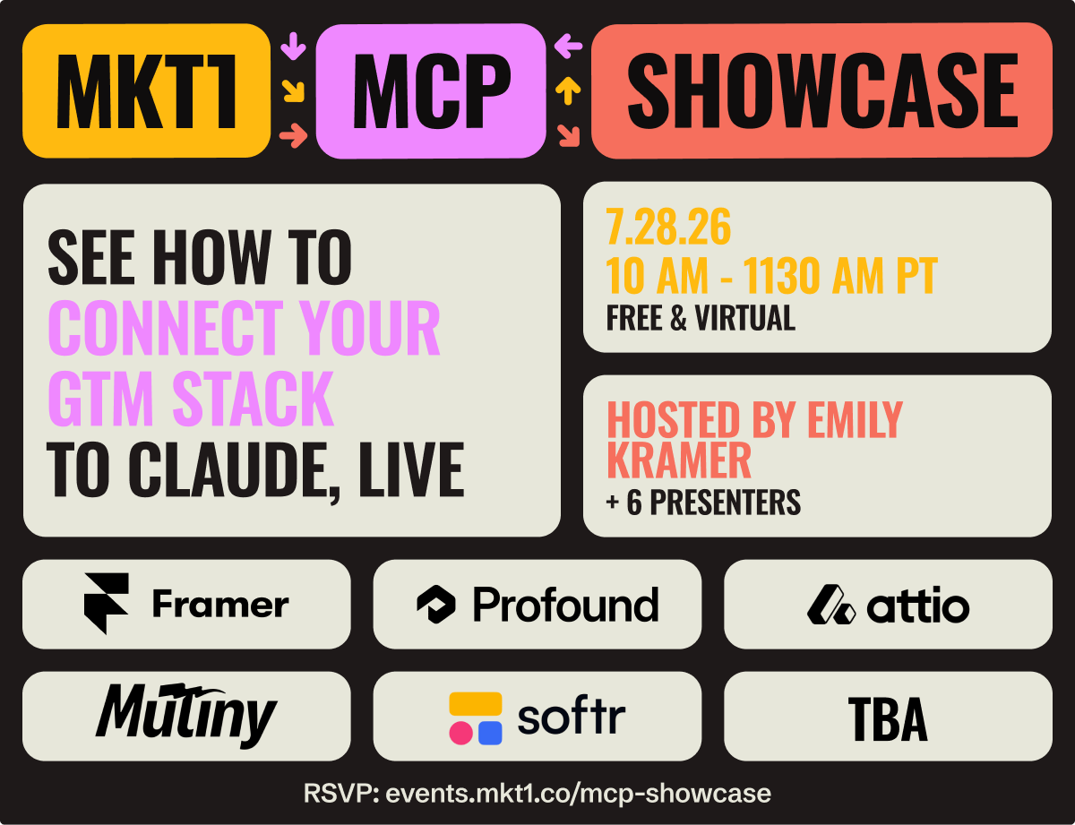
Featuring Framer, Profound, Attio, Mutiny, Softr & 1 more TBA showing marketing workflows with their MCPs in Claude
Back to the newsletter…and my reviews of actual creative.
The billboard reviews
Now it’s time to apply these principles to actual OOH creative I saw on my billboard drive-by with Maya.
I built the entire review process described above into a /billboard-creative skill in the MKT1 MCP, so I’ll run each creative through the skill for a review, and add my own commentary.
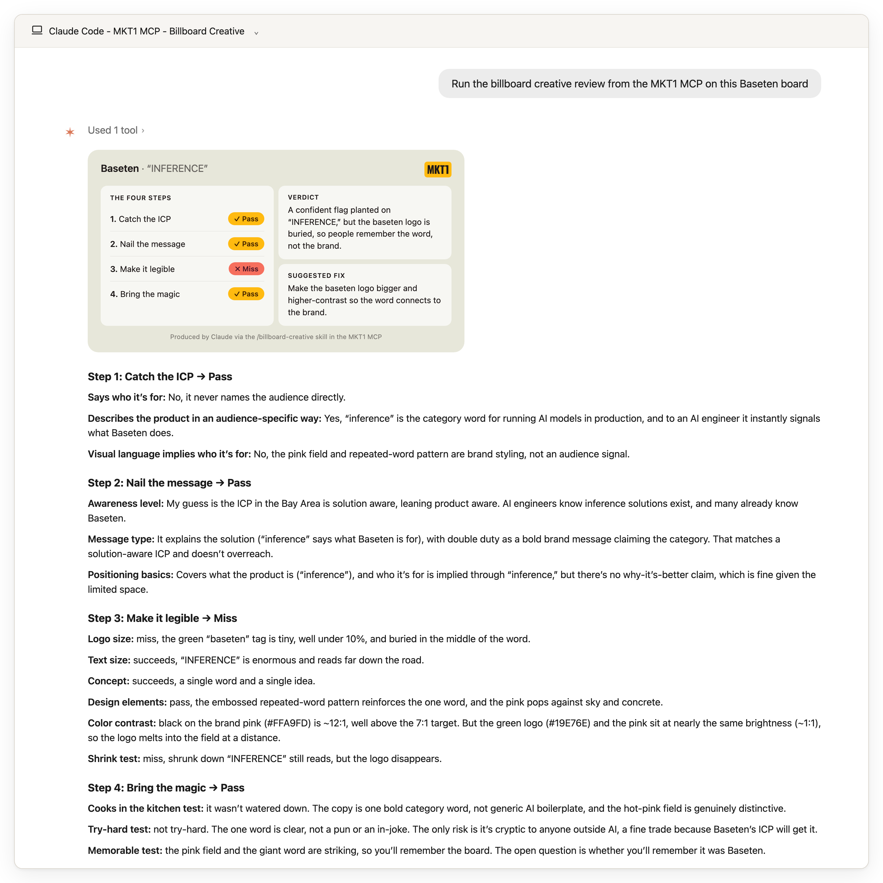
Review: Baseten - Inference x 10
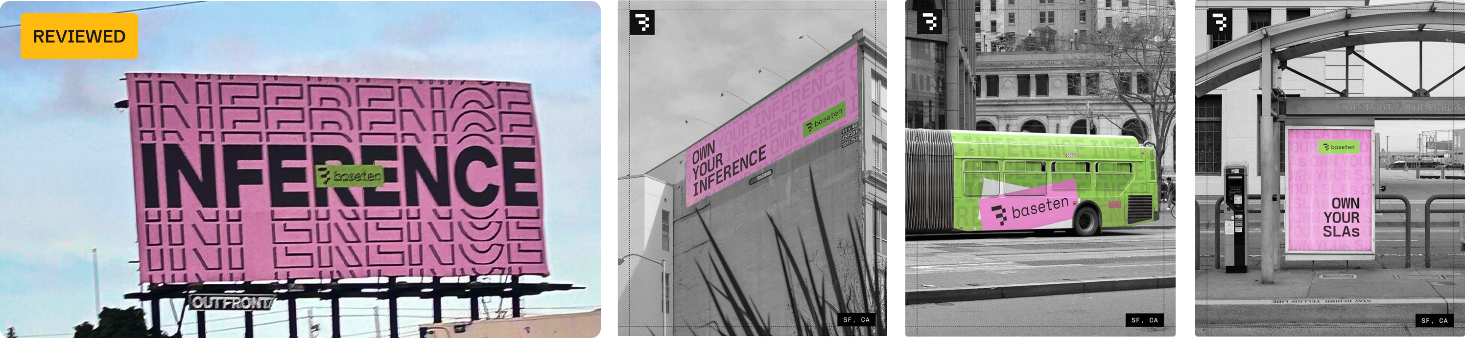
My take
I’m including this review because after I painstakingly (really though) built the rubric and trained the Claude Skill, I still disagreed with some of Claude’s assessment of the repeating “inference” billboard on the left (see scorecard below). Billboard reviews are subjective…and maybe also I’m just nicer than Claude?!
On paper the logo’s too tiny and the green nearly vanishes into the pink at a distance. But Baseten has blanketed SF in this campaign, with bus sides, shelters, and multiple billboards, so by the time you pass this one you know it’s Baseten (though they should still size up that logo). I love this geometric, repeated-type treatment and this palette (clearly my aesthetic, see MKT1’s brand). And it zigs while every other AI company zags into the same blues and blacks. Paired with its friends on the buses, this one brought the magic for me. It pops!
More on my take in the video below!
Baseten billboard review from MKT1’s Claude skill
These summary cards were produced by the
/billboard-creativeskill in the MKT1 MCP (and appended with my personal review). I trained this extensively, so think of this as me + Claude talking, but sometimes we will disagree…
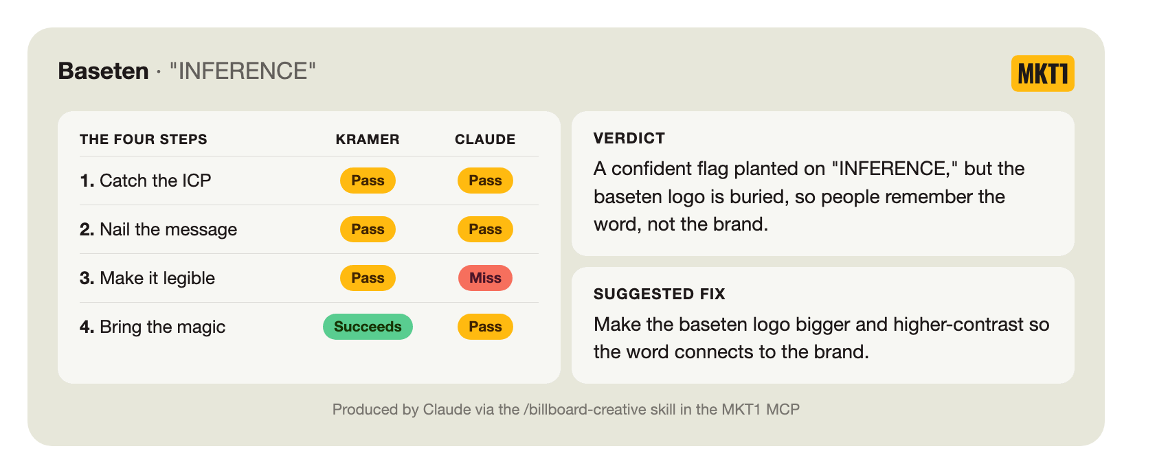
Step 1: Catch the ICP → Pass
Says who it’s for: No, it never names the audience directly.
Describes the product in an audience-specific way: Yes, “inference” is the category word for running AI models in production, and to an AI engineer it instantly signals what Baseten does.
Visual language implies who it’s for: No, the pink field and repeated-word pattern are brand styling, not an audience signal.
Step 2: Nail the message → Pass
Awareness level: Claude’s guess is the ICP in the Bay Area is solution aware, leaning product aware. AI engineers know inference solutions exist, and many already know Baseten.
Message type: It explains the solution (”inference” says what Baseten is for), and it serves double (well more like 10x) duty as a repeated, bold brand message claiming the category. It meets a solution-aware ICP where they are.
Positioning basics: Covers what the product is (”inference”), and who it’s for is implied indirectly through “inference,” but there’s no why-it’s-better claim. That’s okay though, limited space!
Step 3: Make it legible → Miss
Logo size: miss, the green “baseten” tag is tiny, well under 10%, and buried in the middle of the word.
Text size: succeeds, “INFERENCE” is enormous and reads far down the road.
Concept: succeeds, a single word and a single idea.
Design elements: pass, the embossed repeated-word pattern reinforces the one word, and the pink pops against sky and concrete.
Color contrast: mixed, black on the brand pink (#FFA9FD) is ~12:1, well above the suggested 7:1, so “INFERENCE” is razor sharp. But the green logo (#19E76E) and the pink sit at nearly the same brightness (~1:1), so the logo melts into the field at a distance.
Shrink test: miss, shrunk down “INFERENCE” still reads, but the logo disappears, so you can’t tell who it’s from.
Note: I disagree with Claude here. I think it’s legible enough given the city is plastered in Baseten OOH! And as I mentioned in “my take,” I think the design elements are more than a pass but a “succeeds” (I love this aesthetic).
Step 4: Bring the magic → Pass
Cooks in the kitchen test: my quick take is it wasn’t watered down. The copy is one bold category word, not generic AI boilerplate, and the hot-pink field is genuinely distinctive.
Try-hard test: succeeds at not being try-hard. The one word is clear, not a pun or an in-joke. The only risk is it’s cryptic to anyone outside AI, a fine trade because Baseten ICP will get it.
Memorable test: the pink field and the giant word are striking, so you’ll remember the board. The open question is whether you’ll remember it was Baseten.
Note: I also slightly disagree with Claude here, for me this creative brought the magic.
Watch us review Baseten’s creative live on our drive-by
Why does my brain read it as bass-eh-ten though?!
Watch this episode & the rest of the Billboard Drive-By series on YouTube ➜
It’s working because it zigs when all the rest of the AI companies are zagging, right?” –Maya Spivak
Review: Rippling - Dr. Evil Diabolical
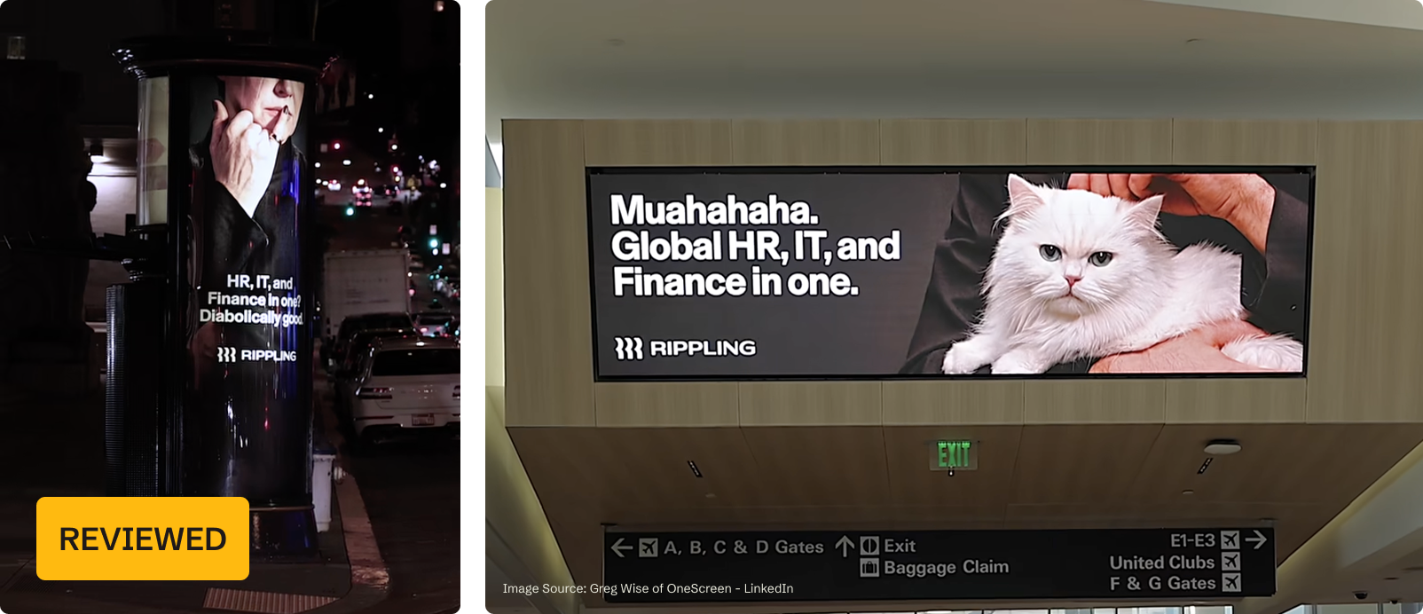
My take
I chose this Rippling “street furniture” sign on the left because, unlike a lot of OOH, it actually tries. It reaches for a real concept (all-in-one software is “diabolically good, muahaha”). It takes a swing at a cultural reference, and it pulls a clever money-saving move in the process: evoking Austin Powers’s Dr. Evil without licensing the official IP, a smart, cheap way around expensive creative. The cat and the finger on the mouth work without needing Mike Myers.
Reaching for a reference like that is a real risk, and for me it didn’t land, the nod feels dated and the copy could be tighter. But that’s subjective, and I’d rather a billboard swing and miss for some (as long as it doesn’t offend someone), than play it safe. And I did leave the Billboard Drive-by video shoot remembering it…
Rippling review from MKT1’s Claude skill
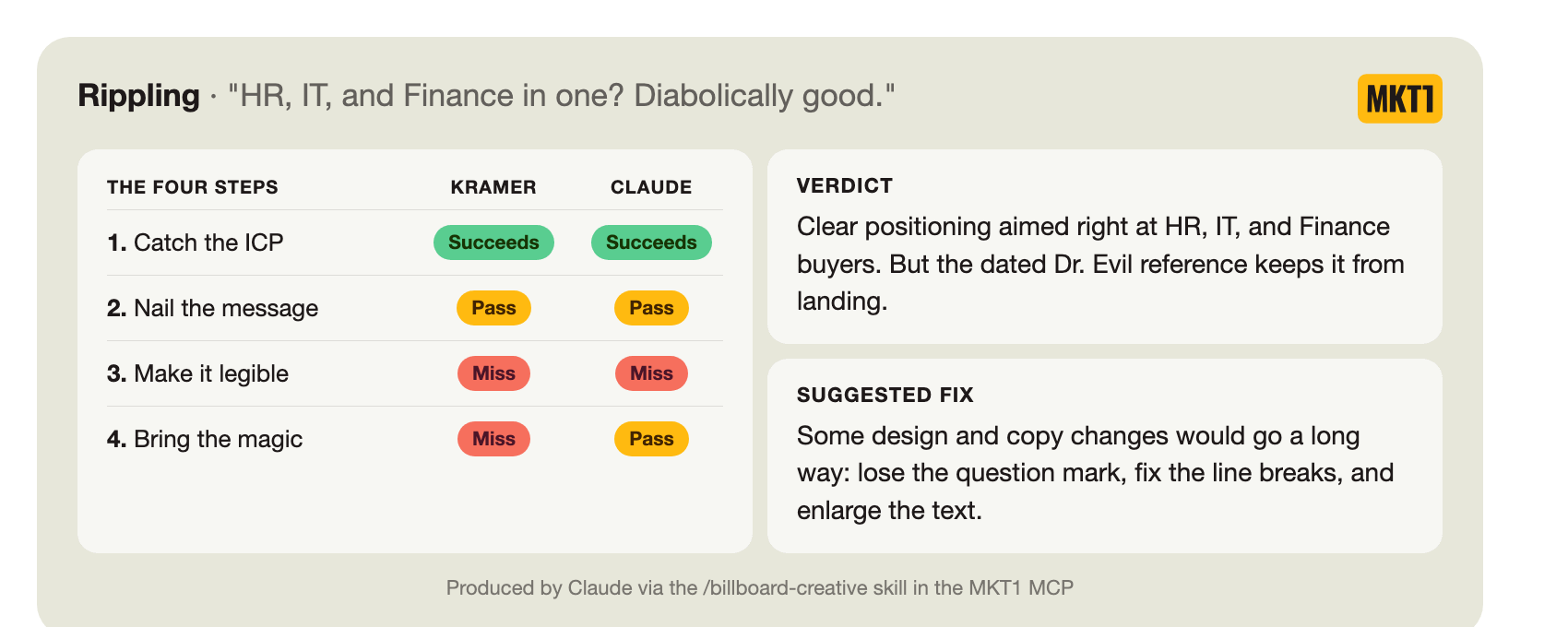
Step 1: Catch the ICP → Succeeds
Says who it’s for: Yes, “HR, IT, and Finance” names the three buyers outright.
Describes the product in an audience-specific way: Not necessary, names the buyers directly
Visual language implies who it’s for: No, the cropped hand-to-chin pose sells the “diabolical” joke, not the HR, IT, and Finance audience.
Step 2: Nail the message → Pass
Awareness level: Claude’s guess is the ICP (HR, IT, and Finance leaders) is brand & product aware. Rippling spends heavily on brand and is everywhere, so most buyers already recognize the logo and know what Rippling does.
Message type: It explains the solution (”HR, IT, and Finance in one”) and states why it’s better (the “in one” all-in-one differentiation), with “Diabolically good” as a brand flourish it’s earned at this awareness level. The message matches the broad audience’s range of awareness levels.
Positioning basics: Covers who (HR, IT, Finance, named) and what (one platform for all three), with why implied through “all in one.” All there, if all-in-one is truly a benefit to all the audiences.
Step 3: Make it legible → Miss
Logo size: pass, the Rippling wordmark reads clearly under the copy, though it’s on the smaller side.
Text size: miss, readable up close, but on the curve of the column it could stand to be bigger. And the line breaks hit at weird breakpoints (the headline breaks at "HR, IT, and / Finance in one?" which splits the list awkwardly).
Concept: pass, it's one cohesive concept, "all-in-one is diabolically good," told across both halves, the copy delivers "all-in-one" and the Dr. Evil pose delivers "diabolical." One idea, not two, though the copy runs a little long at about nine words.
Design elements: pass, the cropped finger-on-face pose ties to “diabolically good,” but it only really lands if you read it as a Dr. Evil/Austin Powers reference.
Color contrast: pass, white type over the dark photo holds up on the darker areas, less where it crosses the lighter skin tones.
Shrink test: miss, shrink the entire creative down, not just the text, and it falls apart, the dark cropped image goes to a blob and the small text becomes illegible, so the whole thing stops working.
Step 4: Bring the magic → Pass
Cooks in the kitchen test: It wasn’t watered down, there’s a clear point of view and a real creative swing.
Try-hard test: As is, the Dr. Evil pose leans on a 25-plus-year-old Austin Powers reference that can read dated to today's buyers. This feels a bit try-hard. The diabolical idea has legs, but could have landed somewhere better.
Memorable test: The diabolical angle is memorable if you catch it and the brand is clear, but the dated reference splits the audience into 3: people who get it and like it, people who get it and don’t like it (Kramer), and the people who don’t get it.
Note: My suggested copy from the drive-by is tighter than what's on this street furniture, if I do say so myself: “HR, IT, and Finance in one: Diabolical." beats the current copy on simplicity and legibility. You don't need "Diabolically good?", the question mark kills it, the word good doesn’t add to it.
Watch us review Rippling’s creative live on our drive-by
Watch this episode & the rest of the Billboard Drive-By series on YouTube. ➜
“ Most of the people buying Rippling right now might not even remember this reference…There’s so many more interesting things you can do for diabolical or diabolically good than a throwback ad.” –Emily Kramer
Note: Austin Powers was never it for me…
Review: Braintrust - Brain rot
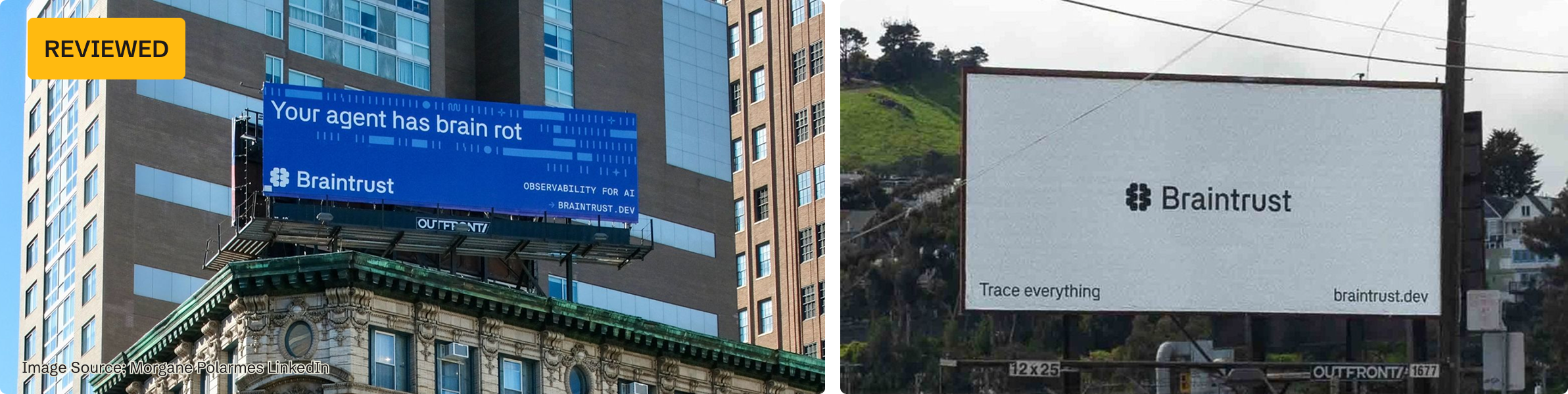
My take
Sorry, another billboard for AI engineers, but they’re everywhere!
I’m reviewing the Braintrust billboard on the right because I saw some of their creative on our drive-by (image on the right), but wasn’t wowed by any means. Then their VP of Marketing, Morgane Palomares, posted about this new billboard, and it stood out.
It hits just the right level of internet slang with “brain rot,” that nods to the name “Braintrust”, while still explaining who Braintrust is for and what Braintrust is. It’s simple, but it really works for me. No surprise: Morgane came from Vercel, which consistently nails billboards that give a wink or head nod to their exact ICP.
Braintrust billboard review from MKT1’s Claude skill
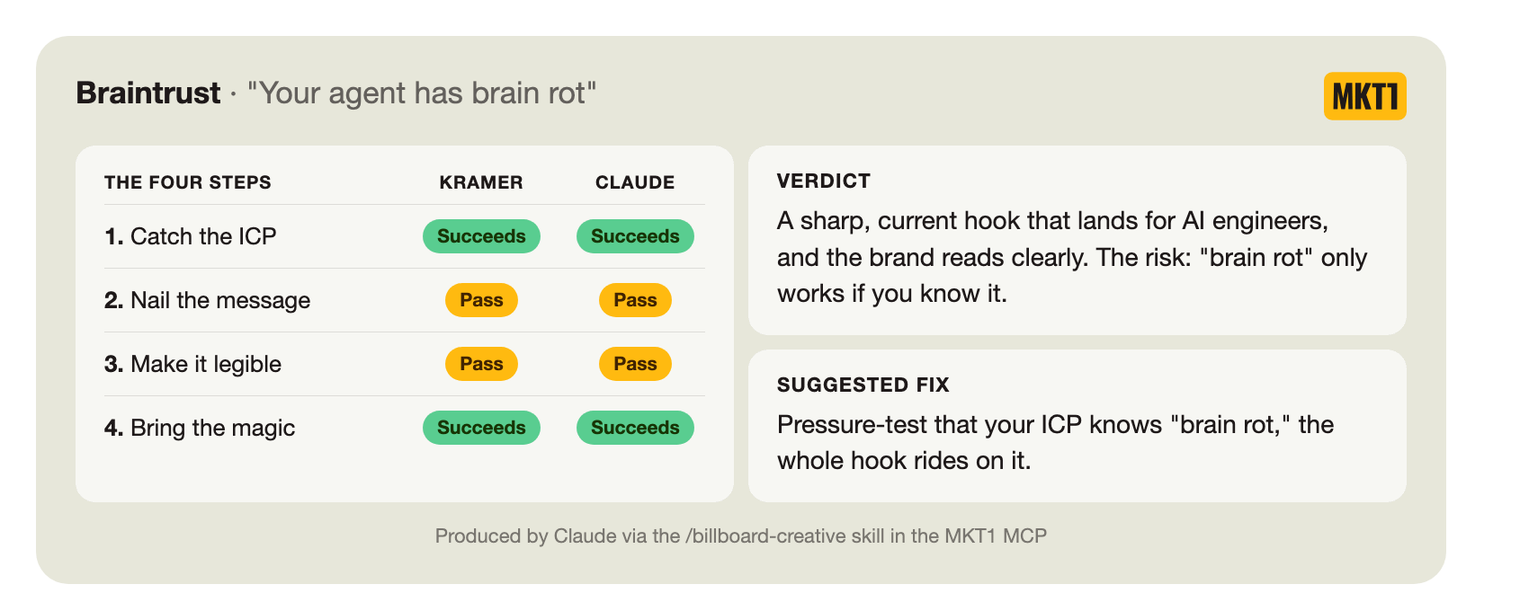
Step 1: Catch the ICP → Succeeds
Says who it’s for: No, doesn’t names the role specifically
Describes the product in an audience-specific way: Yes, “your agent has brain rot” speaks the exact language of people building AI agents, and “observability for AI” says what the product is.
Visual language implies who it’s for: Partly, the faint data pattern reads as a technical tool, but it’s subtle.
Step 2: Nail the message → Pass
Awareness level: Claude’s guess is the ICP in NYC is solution aware. AI engineers building agents know observability and eval tools exist, and many already know Braintrust.
Message type: It both speaks to the pain (”your agent has brain rot”) and explains the solution (”observability for AI”). Speak to the pain works at any awareness stage and explaining the solution is essential when trying to build solution and product awareness. The message matches and doesn’t overreach.
Positioning basics: Covers who it’s for, what the product is, but not why it’s better (which is okay, because of the audience’s awareness level).
Step 3: Make it legible → Pass
Logo size: pass, wordmark bottom-left, reads clearly.
Text size: pass, headline legible (could go bigger); secondary text small but going bigger may clutter the core message.
Concept: succeeds, five words, one idea.
Design elements: pass, the data pattern reinforces observability without fighting the copy.
Color contrast: pass, white on blue, specifically, #2B1EEB is 8.4:1, is above the 7:1 billboard contrast target.
Shrink test: pass, headline and logo carry it; category line and URL disappear at small size though.
Step 4: Bring the magic → Succeeds
Cooks in the kitchen test: succeeds, not watered down; current and opinionated.
Try-hard test: succeeds (at not being try hard), clever and lands, bets on the ICP knowing “brain rot” but that’s a safe enough bet
Memorable: succeeds, funny, current, brand clear.
No video for this one, this was a post-drive by series add!
Review: Framer - We get design
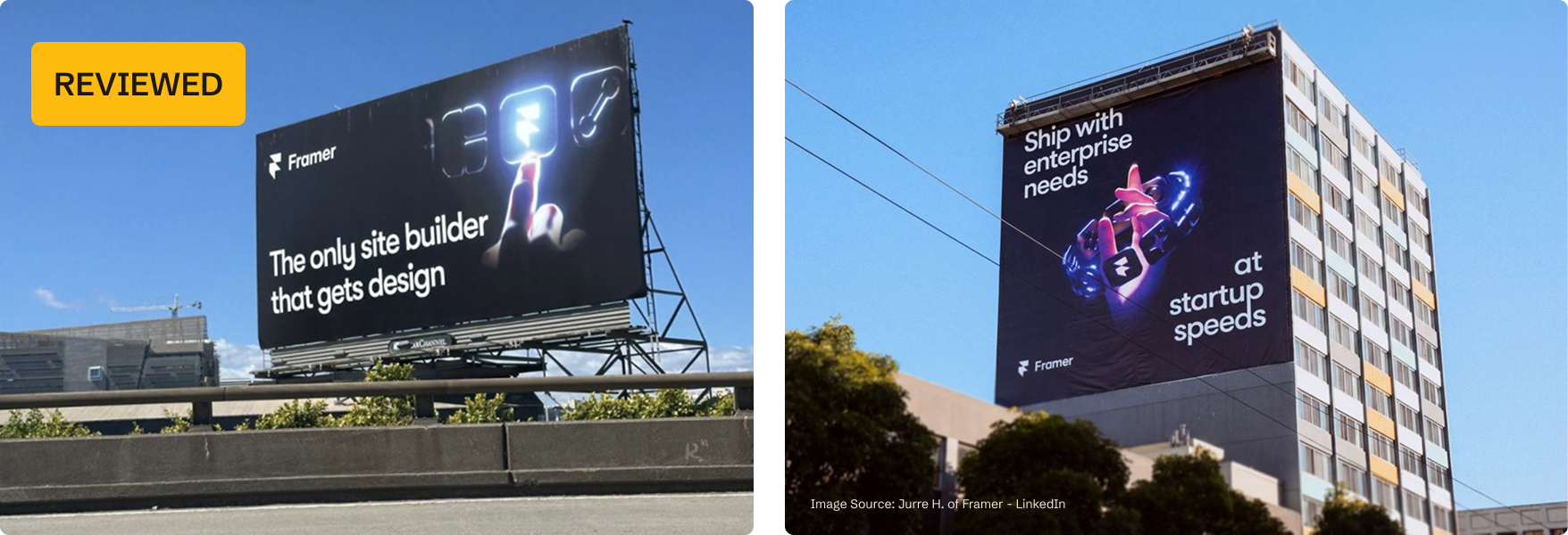
My take
I chose to review this one (on the left) because it’s just extremely clear. It states exactly what Framer is and who it’s for. It nails the fundamentals: high contrast, big font, big logo.
What I really love, though, is that the whole thing speaks to the art of crafting something. The glowing finger subtley nods to Michelangelo’s Creation of Adam fresco at the Sistine Chapel without being snobby, the human hand speaks to craft even without the reference, and they don’t slap the word “AI” on it like every other billboard.
The second Framer board on the right works too, speaking to a different pain (shipping fast without compromising what enterprise needs) and tying it together with the same visual language.
I may be biased since I partner with Framer, but I don’t think so. I think this is just good billboard creative.
Framer billboard review from MKT1’s Claude skill
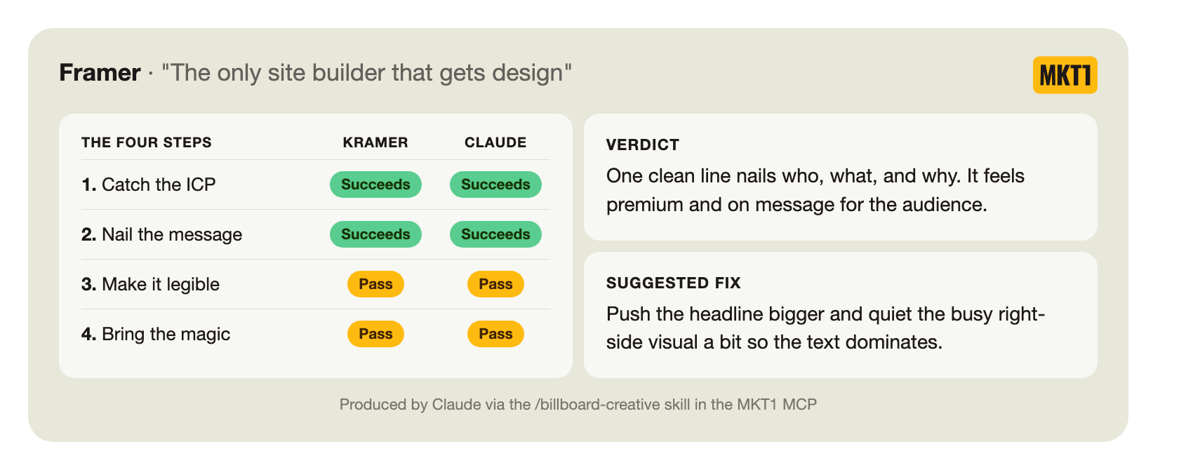
Step 1: Catch the ICP → Succeeds
Says who it’s for: It says design, but not designers (close enough?!)
Describes the product in an audience-specific way: Yes, “the only site builder that gets design” says what it is and implies who it's for in one clean line.
Visual language implies who it’s for: Partly, the dark premium design-tool look reads as a creative tool.
Step 2: Nail the message → Succeeds
Awareness level: Claude’s guess is the ICP in the Bay Area is solution aware, leaning product aware. Designers know site builders exist, and many already know Framer.
Message type: It explains the solution (”site builder”) and states why it’s better (”the only one that gets design”), and it layers for the OOH spread, the plain “site builder” carries anyone less aware while “gets design” rewards the designers who already know the category. It matches and doesn’t overreach.
Positioning basics: Covers who (implied through “gets design”), what (a site builder), and why (the only one that gets design, a real benefit to designers who value design). All three in one clean line.
Step 3: Make it legible → Pass
Logo size: pass, the Framer wordmark sits top-left, white on black, and reads clearly.
Text size: pass, the headline is large and legible, it could be even bigger though.
Concept: succeeds, one idea in seven words, and the finger-to-icon visual reinforces the same “craft” concept
Design elements: pass, the glowing finger-to-icon visual reinforces the design and craft angle, but it’s busy and competes with the text.
Color contrast: white type on the black field is 21:1, the maximum contrast possible on this scale.
Shrink test: pass, shrunk down the logo and text are still legible, but the image may get murky and compete too much.
Step 4: Bring the magic → Pass
Cooks in the kitchen test: this isn’t watered down, there’s a clear point of view (”the only one that gets design” throws mild shade at every other site builder without being too combative) and a premium, distinctive visual.
Try-hard test: It’s clear over clever, not try hard. The Creation of Adam visual could be try hard if they literally used a fresco-style image, but it’s produced well and so, so subtle.
Memorable test: The premium black board and the sharp “gets design” line are memorable. Combined with all the other OOH around town, its even more memorable.
Watch our live review of Framer’s billboards here ➜
Now I’m sending you on your way to plaster the highways with more effective creative…
I wrote 2 newsletters, wrote ~12,000 words, made 10+ videos, and built a 300-line skill on OOH…I think I can safely say MKT1 readers are now armed with clearer ways to make OOH decisions.
And remember, this creative advice is for billboards, street furniture, bus wraps, etc, but it does apply universally:
Don’t assume people have more context or awareness than they do.
Don’t copy creative from a company with more awareness and experience in the channel than you.
Have a point of view. Take risks. But don’t cross the offensive line.
Keep too many cooks out of the kitchen, but still get enough honest feedback that the creative doesn’t flop (and that feedback can come from an LLM now, they don’t have feelings…I don’t think).
And if you still aren’t sure what to do for OOH, or just need some extra hands, call my Billboard Drive-By co-host, Maya Spivak. We may even do another Drive-By, on a double-decker tourist bus or something, and invite friends along. No promises, but it’s a stretch goal for me in 2027!
In the meantime, enjoy the videos on YouTube, create a /gaccs-brief with our Claude skill to get alignment on your next OOH project, then chat with the /billboard-creative skill (also in our MKT1 MCP for paid subscribers) to review your billboard creative—or another company’s just for fun.
Want to evaluate your own billboard creative?
Get the MKT1 MCP for paid subscribers and ask it to run the /billboard-creative skill!
Plus access 25+ additional skills including AEO audits, homepage audits, competitive battle card creators, brief generators, job board search, candidate reviews, etc.
Even more from MKT1
🙏 Brought to you by: Framer, the site builder now equipped with Agents; Profound’s AEO build session; and 42 Agency, the Demand Gen and MOPs agency.
💬 Bring this newsletter to Claude: Chat with this newsletter with this pre-built prompt (free) or use the /billboard-creative skill in our MKT1 MCP (paid subscribers).
🖥️ Webinar - Building an AEO practice: Join me and Nick Lafferty for a live MCP build session on July 23 at 1pm ET / 10am PT. We’ll show 3 AEO workflows you can run yourself with Claude and Profound. Register here.
🔌 Event - MCP Showcase: On July 28th at 1pm ET / 10am PT we’re hosting a showcase with 6 MCPs marketers should know. Attio, Default, Framer, Mutiny, Profound, and Softr will join me to walk through their MCPs, live in Claude.
🤖 MKT1 MCP Server: Add MKT1 skills to your LLMs. Paid subscribers get our full library of 25+ skills and templates, including the /billboard-creative skill featured in this newsletter.
🧱 MKT1 Buildathons: Watch our 5/27 Buildathon to learn more about the MKT1 MCP Server (the event was just for paid subscribers, but anyone can catch up on the replay). You can also watch the replay of our first Buildathon to see how to build a /marketing-strategy-skill in Claude Code.
🪢 Get on our Slack waitlist: We launched a Slack community just for talking about using Claude Code or Cowork and/or our MCP Server. It’s invite-only for paid subscribers using the MKT1 MCP Server. Get on the list ➜
🧑🚀 MKT1 job board - new & improved: Jobs from the MKT1 community (it’s free to post as a paid subscriber). And our candidate form if you’re looking for a new role (option to remain anonymous included!).
🥞 MKT1 Perk Stack - New Perk: Exclusive discounts worth $40K+ on our favorite GTM tools. For annual & superfan paid subscribers only. We just added 3 months free of Granola, check it out!
🧰 Template & resource library: We have 100+ templates and resources available to paid subscribers in our template & tool library.