Your website still matters. Here's what to prioritize now.
What good looks like in the AI era, with 30+ examples from B2B websites.
👋 This is a monthly free edition of MKT1 Newsletter—a deep dive into a B2B startup marketing topic, brought to you by Profound, 42 Agency, and Framer.
Upgrade to a paid subscription for: Full access to our new MKT1 MCP Server | 100+ templates & resources | Post to MKT1 Job Board | MKT1 Newsletter Archive | $40K+ in discounts in the MKT1 Perk Stack
I’ve long said your website is your most important marketing asset. Lately, I’ve debated if I still believe this is true.
Websites are in a state of flux right now: LLMs are increasingly where people research products, so less traffic is making it to your site. The traffic that does show up is harder to convert, because prospects have already half-formed an opinion in a chat window. It’s fair to wonder if the website is still worth investing in.
But I’ve landed on my answer: Your website is still your most important marketing asset, but for different reasons.
Your website is a major source of what feeds LLMs, so what’s on your site shapes what those models say about you. And your website, at least for now, is still where prospects go to evaluate and buy. In a world where anyone can vibe code a decent-looking site in an afternoon, your website is your chance to stand out in an increasingly crowded landscape. Don’t vibe code it into undifferentiated chaos!
(A recent report by Framer found that 83% of marketing teams manage multiple websites—vibe coded chaos is very real!)
All of this changes what you need to prioritize on your website now:
It’s easier to build (and update) websites than ever. Vibe coding and AI tools mean you can spin up pages and match what competitors are doing faster. If you’re not regularly updating your site, you’re already behind.
Less traffic means conversion matters more. When someone does make it to your site, the stakes on that visit are higher. You need to include the details prospects need to convert, and make sure LLMs can parse those details too.
(In that same Framer report: 71% say conversion is their top KPI, but only 12% run A/B tests to improve it)Credibility is a necessity. Product differentiation is harder (because building products is easier now too), so your brand needs to do the heavy lifting. There are more products in every category and savvy prospects can see through flimsy claims and fake social proof.
You’re building for two audiences now. Humans evaluating your product, and LLMs deciding whether to recommend it. And this is different from just optimizing for search. With search, you controlled what search engines said about you, from the title to the meta description. LLMs generate a different answer every time and you need to do more to guide the LLM correctly.
To see what this looks like in practice, I called Casey Hill, CMO at DoWhatWorks. DoWhatWorks scans millions of websites and tracks tens of thousands of A/B tests, and Casey’s talked to 75+ website teams about what they’re building and why. He posts those findings on LinkedIn and in the DoWhatWorks Substack. I asked him what’s standing out right now, scanned through 100s of his examples myself to pick out my favorites, and put together this newsletter.
Recommended products & agencies
We only include sponsors we’d recommend personally to our community. If you are interested in sponsoring our newsletter, email us at sponsorships@mkt1.co.
Profound: Improve your brand’s AI visibility with Profound. Track how your brand shows up across LLMs, then use agents to turn AI signals into AEO briefs, research competitors, and create campaign-ready content. Used by Ramp, Calendly, Zapier, and MKT1 of course.
🔓 Offer: Mention MKT1 to get a free AI Visibility Report.
—
42 Agency runs signal-based outbound and paid programs for B2B startups. From ops set up, warming mailboxes and signal tracking to personalized sequences, account-specific ad targeting, and cross-channel campaigns, they handle it while you close deals.
🔓 Offer: First 5 companies get a free 30-min pipeline diagnostic.
—
Framer: DoorDash, Perplexity, Mixpanel, and Mutiny’s websites are all built on Framer. From early-stage startups to Fortune 500s, Framer is the website builder I personally recommend. It works like your team’s favorite design tool, with AI-powered building, integrated A/B testing, and one-click publishing
🔓 Offer: Get 15% off a Yearly Pro plan with code MKT15. Annual MKT1 Subscribers get 30% off a Yearly Pro plan in our Perk Stack.
In this newsletter:
I cover the website patterns standing out in the AI era. I’ve categorized 30+ examples into four buckets:
Build for humans & machines: We’re now creating content for LLMs, search engines, and humans. These examples cover how to strike the balance.
Examples include: Wispr Flow, Supabase, Railway, PostHogGo beyond basic social proof to show credibility: AI has lead us all to be more skeptical of what’s real, so the old playbook of basic logos isn’t cutting it. Examples include: Clay, Notion, Linear, Intercom
Lower the bar to get started: It’s harder to get people to your site, so when they show up you need them to convert.
Examples include: Lovable, Replit, Framer, Canva, ZapierQuick wins: Other suggestions to make a high-converting, differentiated site fit for the AI era…and some suggestions of what not to do.
Bonus for paid subscribers: We’ve added all of these website examples and more to our new
/website-examplesskill in our MCP Server. You can ask Claude for examples of websites that do “X” and it will check the list and report back. I’ll be adding more examples over time.
Build Claude Code Skills with us this Friday
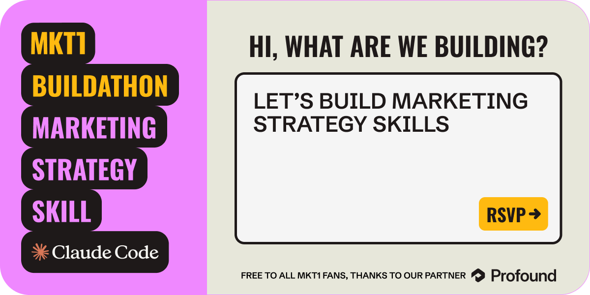
Come to our first-ever MKT1 Buildathon on 4/3/26. I’ll show how to build a /marketing-strategy skill from scratch in Claude Code.
Free to join thanks to our partner, Profound.
Here’s what to prioritize to build a valuable, high-converting website in the AI era…
1. Build for 2 audiences: Humans & machines
You might think we’ve always been writing for machines (the search crawlers), but it’s a different ballgame with LLMs as the new front door. LLMs generate their own answers with their own copy each time. And many people do not click through on LLM answers like they did with search results. So there are new must-haves to make sure your site is AEO-ready, but still valuable to humans.
➜ Make your site readable by LLMs and search crawlers
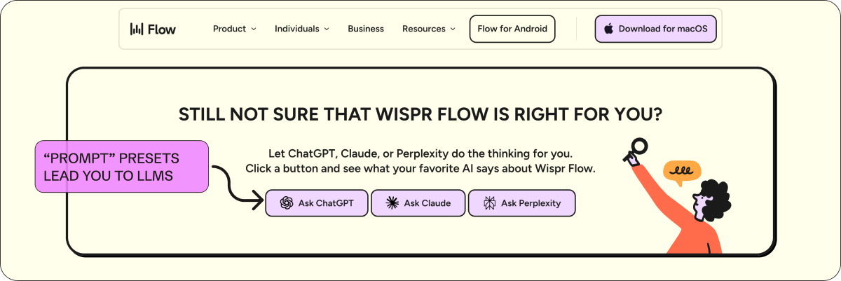
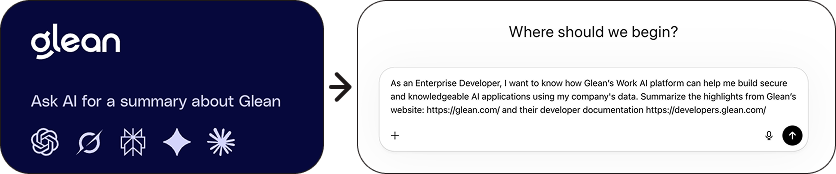
I could write many newsletters about AEO, and the noticeable changes to websites, but here are a few ways companies are making their sites LLM-friendly. Some are creating what Casey calls “prompt presets,” pre-built links that send visitors straight to an LLM. Others are adding structured, machine-readable files to their sites. And some are just putting genuinely useful content in places where both humans and LLMs can find it.
Here are some examples:
Wispr Flow: The boldest version of “prompt presets” I’ve seen. At the bottom of their homepage they say “Still not sure that Wispr Flow is right for you? Let ChatGPT, Claude, or Perplexity do the thinking for you.” Then three buttons: Ask ChatGPT, Ask Claude, Ask Perplexity. It’s a way of saying “we’re so confident in how machines see us that we’ll let them do the talking”—and in their case not just in the footer, but in the flow of the homepage.
Some other examples of prompt presets include Glean & Galileo.
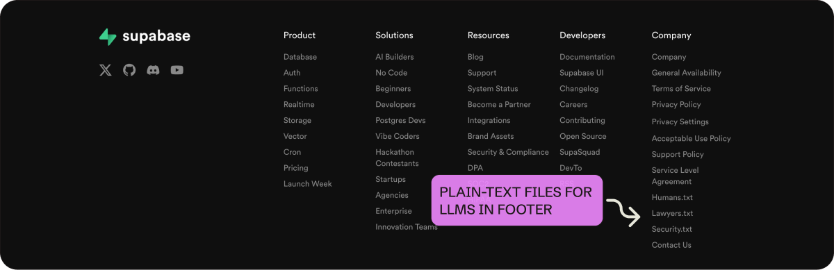
Supabase: They link to humans.txt, lawyers.txt, and security.txt in their footer. These are plain-text files that give agents and crawlers a clean, structured way to parse who built the product, what the security policies are, and where to find legal info. Instead of making machines scrape your About page or navigate your legal docs, you give them a direct endpoint.
More on the point of .txt files in this post from Casey »
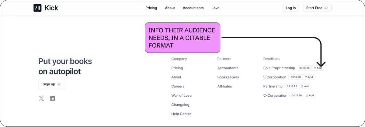
Kick: This is really clever! Kick lists tax filing deadlines by entity type (S Corp, C Corp, Sole Proprietorship, Partnership) with add-to-calendar buttons next to each one. This shows they really understand their audience. Plus, they did this in a format that’s useful to humans (with an add to calendar option) and easy for LLMs and search engines to cite.
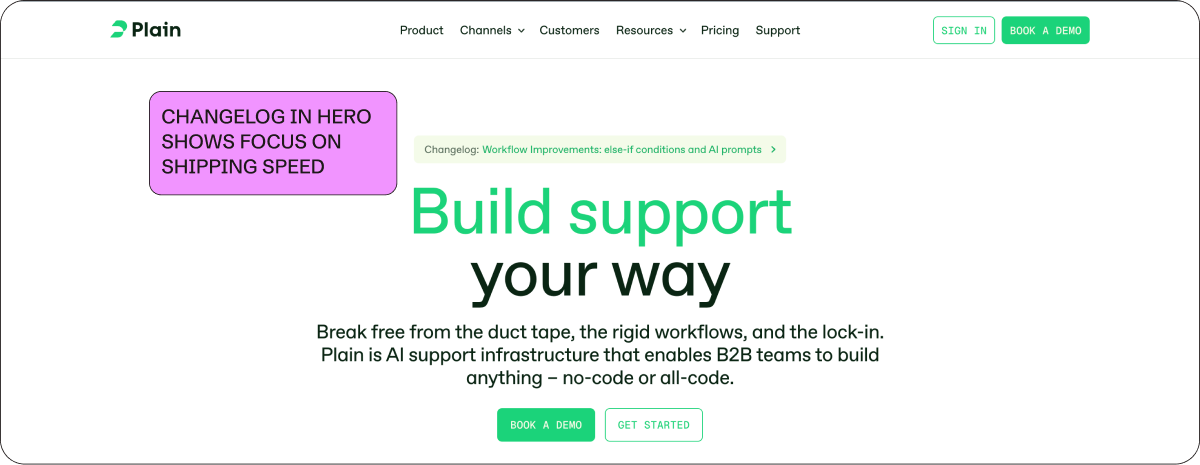
Plain: They put a link to their changelog right in the hero. It signals shipping speed and shows the product is actively evolving. And a changelog is structured, frequently updated content that keeps your site fresh for crawlers.
➜ Put effort into competitive positioning, for both humans and machines
Comparison pages have always done double duty: They rank in search and they help people who are actively evaluating you against alternatives. Now there’s a third reason to invest in them. LLMs pull from comparison content when someone asks “should I use X or Y,” and if you’ve built that page, you have a shot at shaping the answer. Competition has heated up in every category, which makes these pages more important than they’ve been in years.
Here are some examples:
GC.AI: GC AI knows that ChatGPT and Claude are real competition, so they get right to it. Their homepage has a dedicated section that compares GC AI, ChatGPT, and Claude in a feature table side by side. Framer does the same thing with a dedicated Claude comparison page, and according to Casey this page was ranking in ChatGPT within a month of going live.
Railway: After each feature section on their homepage, they include “Alternative to” followed by competitor logos. It’s subtle and doesn’t seem super aggressive, but is really effective!
Casey details why this works so well here »
ElevenLabs: They add customer logos under each homepage product section. This shows off use cases for the product and social proof at the same time. These simple logos are doing a lot of heavy lifting, teaching you how the product is used and signaling credibility.
PostHog: Their entire site is a 90s throwback, worth studying for how humor and honesty build trust and differentiation. But the competitor comparison pages are the standout. They have a side-by-side format: “A competitor might suit you better (for now) if...” next to “Reasons to choose PostHog.” They admit their own gaps. Also a must-see: “You’ll hate PostHog if...” page.
Other LLM-friendly web suggestions:
Link critical content from your footer: LLMs (and search engines) seem to overweight content that’s accessible from global navigation.
Examples: ClickUp links 50+ pages from their footer and Clay links customer case studies directly from their footer nav.
More on this in DoWhatWorks Substack >>Add FAQs to your pages: Structured Q&A is one of the easiest formats for machines to parse and cite.
Examples: Zapier has FAQs throughout their product pages and DoWhatWorks (where Casey is CMO) has one too.
More on the importance of FAQs from Nick Lafferty, Head of Growth Marketing at Profound »Check for things that LLMs can’t “read”: Hover states and tooltips (invisible to agents), scroll-to-load content (agents can’t trigger the scroll), video transcripts, and content hidden in dropdown menus.
2. Go beyond basic social proof to show credibility
Social proof has always mattered, but when every category has more products and buyers are more skeptical of fake content, who your customers are and how you present them can be a real differentiator. The problem is that most sites are still doing social proof the way they did it five years ago. A logo bar, a quote carousel, maybe a case study page buried in the nav. The companies standing out right now are rethinking what proof looks like, where it lives on the page, and how much of it a visitor can actually verify.
➜ Make your logos verifiable
The logo bar has been a homepage default for as long as I can remember. Slap some recognizable names below the hero, signal credibility, move on. But we all got a little suspicious about which logos were real (or whether a logo churned two years ago or one employee used the product once). Now companies are making logos interactive, clickable, and tied to real stories and stats, which is much harder to fake.
Here are some examples:
Clay: One of the first to do this. Hover over a logo and you see a quote from a real person with their name, role, and photo. Logos are labeled “Case Study” or “Hackathon” to indicate what you’ll see when you click through. Dozens of companies have copied this since, and they should. It’s a great idea.
Casey talks about how basic social proof bars typically perform (not great), and why verifiable proof works better here »
HeyReach: Goes a step further with their social proof bar. Hovering over a logo shows a quote, real performance metrics, and/or what tools the customer uses alongside HeyReach. Click through and you get an actual playbook with campaign workflows and email templates.
Casey’s take on HeyReach’s Homepage on LinkedIn »
Notion: A sticky logo bar is pinned to the bottom of the viewport. This way, social proof stays above the fold and expands with more detail on scroll. We see this with sticky nav bars to the top of the page, but I love the idea of getting creative with what “sticks” on scroll and where it is on the page.
➜ Extend proof beyond the logo bar
Logo bars are now table stakes. So, the best sites are building credibility in other ways too: security certifications, filterable customer lists, video testimonials throughout the page, etc. The common threads are making “proof” specific, verifiable, and easy to find.
Clay & Sierra: both have prominent security certification sections on their homepages (SOC 2, GDPR, ISO 27001, etc.). These aren’t social proof in the traditional sense, but for enterprise buyers they function the same way and are super important for signaling credibility and durability.
Linear & Intercom: Linear’s customer page has logos organized in a filterable table by industry. Each row shows whether a case study exists (”Read Story”). This makes for a more scannable way to view a customer list. Intercom does something similar with filters by use case and industry, and prominent video case studies.
Casey’s take on Intercom’s Customer page on LinkedIn »
CentralHQ: Testimonials have bold headers that read like feature callouts. Each one links to the original source on Twitter/X, LinkedIn, or G2. They make social proof scannable and claims more credible at the same time. Some quotes also mention switching from competitors by name, so the social proof doubles as competitive positioning too.
Profound: Event callouts are another way to show credibility. So, companies are giving upcoming events meaningful real estate on their homepage. Profound has a dedicated section for their Zero Click conference right on the homepage. If you’re hosting a conference and people are showing up, that says something. And right now events can be your best-performing channel, so it’s a great secondary CTA that’s lower-commitment than requesting a meeting.
A note on social proof: DoWhatWorks has tracked 1,347 A/B experiments related to showing logos on websites. Static logo bars score just 18 out of 100 on their algorithmic predictor of success for SaaS companies. But it's not just logos, basic company stats ("trusted by 10,000+ teams") and single-line quote testimonials aren't doing much better. The more vague and high-level the social proof, the worse it performs. So get specific.
3. Lower the bar to get started
It’s harder to get people to your site, so when they do show up you need them to convert. To lower the conversion barrier, companies are adding LLM-style input boxes to their homepage, templates that show you what to do first, and migration help that makes switching feel easy—and sometimes all three.
➜ Use LLM-style text boxes as product onramps
More and more companies are putting an LLM-style input box right in the hero. It’s the interface people are used to now, and it doubles as an onramp into the product. Instead of “sign up for a free trial,” you just start typing.
Casey writes about a bunch of these examples in this LinkedIn post »
Lovable: The hero is an LLM input bar. Describe what you want to build and you’re immediately in a creation flow. I think they kicked off this trend!
Framer: They have dual CTAs in the homepage hero, “Start for free” and “Start with AI.” The AI path takes you to a page with a chat box to get started (and below that is a full template gallery).
Mutiny: They take a slightly different approach. Instead of a typeable input box, their hero rotates through prompt ideas showing what the product can do, then you click get started and jump into the onboarding flow.
➜ Bring your product to life with templates & examples
Template libraries have been around for years, but I’m seeing them move to the homepage more and more. And for AI companies, prompt libraries or suggestions are the new version of a template library. They let users start from something that already works and see the range of what the product can do.
Replit: Below their text-input box, they have preset templates like “B2B project management app” and “Startup pitch explainer.” It helps you understand what the product can do and get going right away. v0 by Vercel has a similar setup.
Canva: They are known for their in-product templates for design, and they display these prominently on their homepage.
Notion: Their use case pages show copy and paste-able prompts with a “Try it!” button and a video walkthrough. This combo gives you proof that it works and lowers the learning curve.
➜ Simplify the path to migration
There’s a lot of change happening right now due to AI, and switching to modern software feels really hard on top of everything else. If you can make migration feel easy, you remove one of the biggest reasons people don’t convert.
Pylon: Their social proof bar is segmented by “Migrated off Zendesk,” “Migrated off Intercom,” and “Others.” Social proof, competitive positioning, and comfort that switching is possible in one element. Well done.
Zapier: Their top banner reads “95% of AI initiatives stall. Be the 5% that break through. Get an AI consultation.” Instead of announcing a fundraise or a webinar, they’re using the banner to position themselves as the guide for AI migration and offering a consultative call to help. Casey’s take on this banner on Linkedin »
Stable: Uses one line in their hero to signal the ease of switching: “Our AI assistant makes switching to Stable easy.” It shows they’ve thought about migration and built for it, and provides that reassurance at a key conversion moment.
Mintlify: They have two clear paths at the bottom of their homepage instead of one generic CTA to sign up or request a meeting. “Pricing details” and “Quickstart” are common next steps for people who have made it to the bottom of the page. It also shows they aren’t afraid of showing pricing, which always makes the buying experience way better for prospects. It’s the same idea as the examples above: think about where your visitors actually want to go and make that path obvious.
Add the MKT1 MCP Server to use our website-examples skill in Claude
We’ve added all of these website examples and more to our new /website-examples skill in our MCP Server. You can ask Claude for examples of websites that do “X” and it will check the list and report back. I’ll be adding more examples over time.
Anyone can install our new MCP Server and get access to newsletter content in Claude, but only paid subscribers unlock the full set of skills. Upgrade now to get full access.
More quick conversion wins
Beyond building for two audiences, rethinking social proof and credibility, and making it easier to get started, there are a few more things you should consider to improve conversion. And a couple things to avoid…
Pricing pages: I’ve been preaching this for years, but I’ll say it again: You absolutely need a pricing page, no excuses. Your pricing page is one of the highest-intent pages on your site. Prospects will find out your pricing one way or another (like by asking an LLM). Make it accessible and scannable and don’t hide the information people are looking for.
Casey points out that Jira has the highest price he’s seen listed on a pricing page in this LinkedIn post »
Meeting scheduling in your demo flow: I’ve also been preaching this for years; you need to make it easy to book a meeting directly from your site. Having someone wait for an email to schedule a meeting is ludicrous in 2026. Tools like Default, RevenueHero, and ChiliPiper make this simple.
Look like a modern (read: AI) company: In addition to the LLM-style input boxes covered above, there are a couple other visual trends signaling “we’re an AI company,” if that’s your goal.
Big logos in the footer and hero are everywhere right now: Arcade, Granola, Wispr Flow, Gamma, and more.
AI-generated hero landscape images are becoming a visual shorthand for “we’re modern” (see Mintlify and Railway).
Lastly, here are a few things that the jury’s still out on…
MongoDB has a persona selector in the hero that changes the page content based on whether you select developer or a business leader. It’s interesting but very clunky. It might be best to leave this customization behind the scenes using personalization tools. Sage has an extremely similar looking hero, including an audience selector.
ClickUp’s homepage says “It’s like adding 15 full-time employees” with specific ROI stats. This may work, but it starts to get awkward when we’re talking about replacing humans so explicitly. I’m watching how audiences respond to this kind of positioning as AI really does replace us…ahhhh!
Now go fix your website…
If you take one thing from this newsletter, go look at your own site with fresh eyes. Not as a marketer, but as a prospect who just got a recommendation from Claude and then visited your site. Is your social proof verifiable? Can an LLM actually read your site? Is it easy to get started or book a meeting? Does it look like it was updated in this decade, if not this year, if not this month? If the answer to any of those is no, you know where to start.
If you need additional help checking your website, 2 skills in our MCP server can help.
The
/homepage-positioning-checkerskill will evaluate your site against the MKT1 positioning framework.The new
/website-examplesskill lets you ask Claude for examples of sites that do “X” (social proof, migration, LLM readability, etc.) and it’ll pull from the catalog we built for this newsletter.Once you add our MCP Server (for paid subscribers) to Claude, just ask it to run these skills, more details here.
More from MKT1
🙏 Brought to you by: Profound (AI visibility platform); 42 Agency (paid media, outbound, and Mops agency); and Framer (website builder). All 3 companies have offers for MKT1 subscribers!
🙏 Thanks again to Casey Hill for the conversation and most of these examples. Follow him on LinkedIn and check out the DoWhatWorks Substack. He posts new website breakdowns constantly and they’re always worth reading.
Bonus: DoWhatWorks is giving priority access to MKT1 subscribers to their new agentic product for web feedback and optimizations
👩💻 Claude Code Buildathon: Our first-ever Buildathon is on 4/3 at 9am PT / 12pm ET. I’ll show you how to build a marketing-strategy-skill in Claude Code—while you build along! RSVP now to save your spot.
🗓️ Meet me at Profound’s Zero Click SF event: An exclusive gathering for the world’s top AI Search experts on 4/8/26. Register here »
📦 MKT1 Unboxing: Watch our video series to see Kramer (that’s me) unbox Mutiny, Wistia, Luma AI, & Attio.
🥞 MKT1 Perk Stack: Exclusive discounts worth $40K+ on our favorite GTM tools. For annual & superfan paid subscribers only.
🧰 Template & resource library: We have 100+ templates and resources available to paid subscribers in our template & tool library.
🧑🚀 Job board: Jobs from the MKT1 community (free to post as a paid subscriber). And our candidate form if you’re looking for a new role (option to remain anonymous included!).


