


How to create a more effective homepage
A step-by-step guide on improving your homepage content & copy to increase conversion

👋 This is a monthly free edition of the MKT1 Newsletter—a deep dive into B2B startup marketing topics. To receive an additional newsletter each month, read our archives, post to our job board, and access our template library, become a paid subscriber.
At least once a day, I see a startup’s website and think, “I have no idea what this company does.” If I am able to get a sense of what the company is building, many times I have no idea who they are building for or why someone would choose this product. And I don’t think I’m alone here. We’ve all scrolled down through an entire homepage and just thought, “huh?”
Many (most?) websites, especially for early and growth-stage companies are ineffective. They don't tell visitors who the product is for, what the product does, and why the product is better. When your homepage content and copy miss the mark, your conversion rate suffers, and all of your top of funnel efforts are wasteful.
There are many levers for improving homepage conversion, this newsletter focuses on the “fuel” of your homepage: copy and content. When you nail your copy and content, your audience understands exactly what you do, feels spoken to directly and specifically, thinks you’re credible, and wants your product now.
Step 1: Make a usable 1-2 page messaging guide
To create a homepage that tells your story effectively start with a simple messaging guide. Most messaging guides for startups are ~9 pages too long. They are so specific and so detailed. They take a ton of time to create, but often don’t get used. Don’t make one of those.
Use a simple framework instead and keep top-level messaging to <1 page. Create messaging building blocks that can easily translate into copy for web and other marketing assets. Get buy-in on the messaging building blocks up front, so you can move faster when copywriting for various channels and assets.
Before you start on your messaging guide, it’s extremely helpful to do basic audience analysis & persona development and competitive analysis that maps where you fall in the ecosystem. This makes the messaging guide process more fruitful and effective.
More on creating your messaging guide in the MKT1 guide to positioning.
Create top-level messaging building blocks
Start by creating messaging for your primary audience, then do the same process for additional audiences or personas. Fill out these main building blocks to start. These top-level building blocks will help you create the rest of your messaging guide, so I recommend getting buy-in on these from a (small) cross-functional group before moving forward.
Note: Messaging is not copy. Think of messaging as guidelines for copy. It’s the intent behind what you’ll actually say. Copy is the exact words tailored to channels and assets.
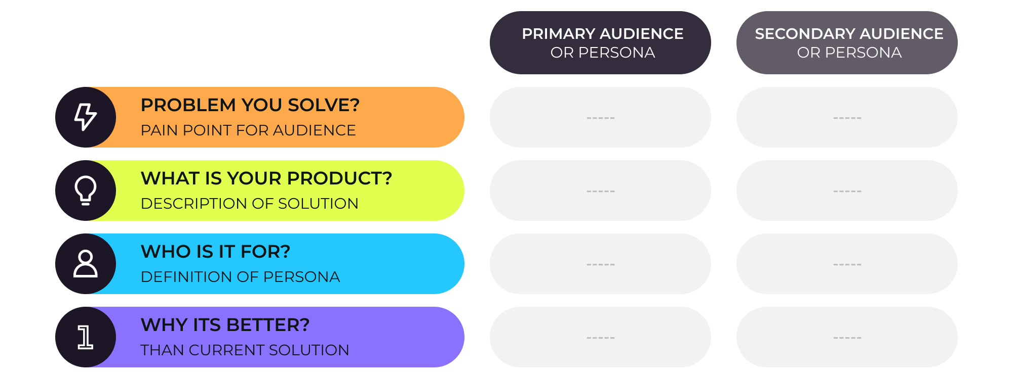
Create and get buy-in on additional messaging blocks
The other messaging building blocks you need are:
Benefits and corresponding proof points (like features or stats). These benefits should go one level deeper from your top-level “why it’s better” messaging and focus on the value or outcome your audience will get from your product.
Use cases with corresponding personas. You can list several use cases for one audience or list out use cases for different personas/audiences depending on if you have a vertical product or a horizontal product.
How your product works with ~3 clear steps, especially if you have a complex product or are a new category/type of product.
Step 2: Plan your homepage layout
We’ve all seen sites that are too difficult to navigate and too visually complicated for their own good. Cognitive overload sets in due to jarring animations, overuse of carousels, complicated UX, etc. Too often, startups create homepage sections and layouts that try to reinvent the wheel.
These websites are not only hard to maintain (since you likely don’t have a web dev team or dedicated web designers in-house early on), but also distract users from converting to qualified leads. For early-stage startups, you can follow a formula, adapt it a little bit, and use copy, color, font and visuals (images, screenshots, and diagrams) to differentiate your site without having to get too fancy with sections, layout, and animation. I recommend Webflow, over 50% of the startups I work with use it.
A clean, simple-to-scroll-through, easy-to-scan website is more likely to convert and even stand out than a confusing, atypical UX.
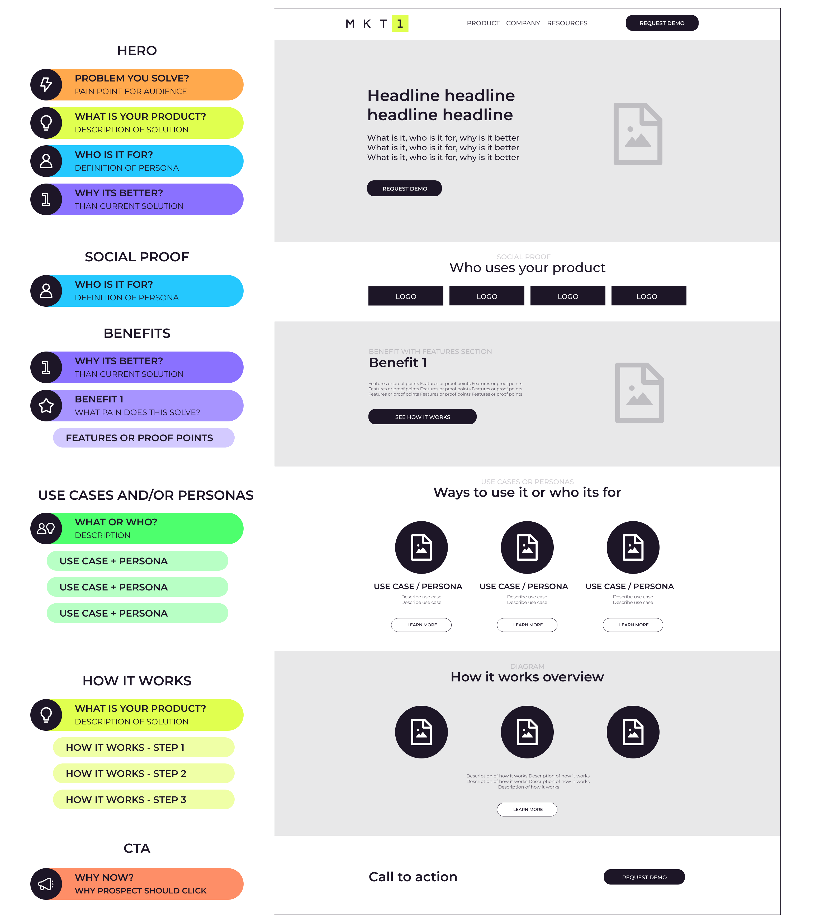
My formula for sections you need on a B2B homepage for early & growth-stage startups:
Scroll down for wireframe example
Top nav: Includes links to the product page, resources, pricing, etc. Plus a sign-in link and primary CTA button.
Hero: Include top-level messaging building blocks and (optional) product screenshot, diagram or video.
Social proof: Usually logos, sometimes logos + quotes. Include a heading that describes who your customers are.
2-3 benefits sections that include product images (stylized or screenshots; static or animated).
Use case and/or persona section (optional), include 1 or both of these:
~3 use cases in one section and how you do those use cases in your product, usually with links to separate pages on these use cases.
~3 different audiences or ICPs and how these personas benefit from the product, with links to pages for these audiences.
How it works section (optional): preferably including a clear diagram.
CTA Bar: Restate why someone needs your product now, with a primary CTA button. This should always be right above the footer.
Note: The order of the sections between the hero and CTA bar is flexible, whatever works best for telling a cohesive story.
Here’s a wireframe with recommended sections:
Plus the messaging building blocks you should use to write copy for each section.
Step 3: Use messaging building blocks to add copy to each section
Now take the messaging building blocks you’ve already gotten buy-in on and turn it into copy and content section by section. See the above wireframe for a visual on how to apply messaging building blocks to each section.
Hero section
Use the headline plus the descriptive paragraph underneath to cover your top-level messaging building blocks: problem you solve, product solution, who it’s for, and why it’s better. Don’t add too much copy or too many CTAs in this section, your conversion rate will suffer.

In the example from Anrok above, you can see that they included all of their messaging building blocks in the copy:
Problem: Sales tax compliance is a manual process
Product: Sales tax automation platform for SaaS companies
Why it’s better: Automates sales tax compliance across your financial stack
Who it’s for: SaaS startups. In the next section, they explain it’s for finance and ops teams specifically, they could include that in the hero for even more clarity.
Social proof section
Often the headline in the social proof section of your website is wasted, it will say something like “Companies love us”. Get more specific in the copy and include your “who it’s for” again, e.g. “Top GTM teams love Pocus”, “Join thousands of developers using CodeSee”
Whether you include quotes, logos, or both, use this section to build credibility and make visitors feel like your product is specifically for them.
Benefits with proof points sections
You should include 2-3 benefits sections with similar layouts. Your 3 benefits combined should be differentiated from competitors. Each benefit should contain proof points underneath, in paragraph or bullet form. Proof points can be features or stats, as seen in the two examples from Guide.co below.
It’s helpful to include product shots here, whether stylized screenshots or gifs. I prefer screenshots over illustrations or photos in these sections because the visual context serves as an additional proof point.
Note: I see people get very hung up on the semantics of “benefits”, “features”, and “value props.” Don’t worry too much about this. Make sure your 3 “benefits” tell the web visitor why they need your product to solve their pain points. Why should they pick you? Focus on the value or outcome they’ll get from your product.

Use cases or personas section (optional)
In this section, include descriptions of ~3 use cases or descriptions of ~3 different audiences or ICPs. This section should give a deeper dive into what your product is and explain how your product works for different audiences or use cases. You can then link to the audience or use cases pages with more details. Don’t worry about having all these additional pages built out for your initial website launch, make them fast follows.
If you have multiple personas (ICPs) this section can be a really helpful way to route secondary audiences to the right place and avoid trying to speak to everyone on the homepage. You can even move the section higher on the page to route people to the right page faster.
You can see in the examples there are many ways to lay this out, I think the simplest way is the 3 or 4 column approach used by usenash.com and arrows.to.

How it works section (optional)
In addition to a section on use cases, it can be helpful to have a how it works section with a diagram. This is especially the case if your product is complex, integration-heavy, for developers, or in a brand new category (you don’t replace an existing technology).

CTA bar at the bottom
Just above your footer, you need another CTA section. This section is simpler and smaller than your hero, but restates your overall messaging and focuses on why someone should click your request demo or sign-up button immediately. Create urgency here.
—
There are lots of other sections you can include on your homepage, including recent press or blog post cards and security or award badges (think SOC 2 and G2 Reviews). But, for your early-stage site, starting with these will be your best bet.
More from MKT1
✂️ Templates for paid subscribers: Paid subscribers can find all templates here, including a website assessment checklist, examples of websites from early & growth stage companies, and a homepage messaging template.
🧑🚀 Job board: See roles from the MKT community. Paid subscribers can add jobs to our job board for free.
👁️ Related newsletters: Guide to positioning, Fixing your demo flow, Effective pricing pages
📖 Keep reading: Paid subscribers get access to the rest of this newsletter which includes Step 4 in the process: writing better copy on your homepage.